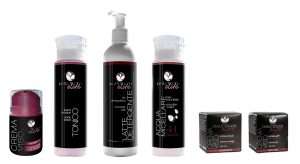
In just a calendar year, UT Europe Srl has completed the restyling of all brand Daily Touch cosmetics products. Without changing a comma in the quality of products, nor on the price, always affordable and competitive, the company from Genoa center and the international business has dressed the entire personal care line with modern graphics: hot silver and pantone marsala on an elegant black background.
If it is true that the eye wants its part, it is even more true that, among so many products displayed on the shelves of hundreds of supermarkets, the choice of a buy is determined 95% by the emotion caused by the packaging view and colors.
But it is not only the view to lead the consumer’s hand from the exhibitors to the cart, and from the cart to the register: it is, in fact, an over-stimulated sense that should also be supported by two other important senses:
- Touch: how many positive emotions, or negative, can transmit the first contact with the product? Heavy, light, smooth, rough, etc.
• Smell: once bought, for example, how a face cream can treat the perception with a good perfume and as consequence can trigger positive associations in the memory drawer?
To retain each individual user, however, it is not enough just “the first time”. A company has really scored a goal when the purchase is repeated with eyes closed and without second thought- at that point the product has affected the heart and the emotions of the customer.
The results of the sales of UT Europe 2016 show that: after trying the foot moisturizing gel, just to give an example, some customers began to order them whole boxes by e-commerce (https://uteurope.pswebshop.com/it /home/63-gel-piedi.html) to be sure to never run out. Thanks to its beautiful graphic? Maybe , but if it wasn’t an effective cream they would have stopped at the first tube.
